How I designed an online thrifting app during the pandemic — A UX Case Study
You will find a detailed account of all the decisions made to design a thrifting app for the Indian market during the pandemic

A few months ago, when the whole world was on lockdown dealing with the pandemic, I was trying to figure out what to do with all the extra time I had, besides working full-time as an IT project manager.
I always knew that I was more enthusiastic about planning the designs and features of a product than just managing the project. Over the years, I found myself more interested in brainstorming and researching design solutions and hence I wanted to explore the world of UX design.
The next thing I knew, I have enrolled myself in a 1:1 mentorship User Experience program to learn anything and everything about UX design.
Here is a case study which I’ve worked on from scratch — thinking of a concept to planning the features to finally designing the prototype.
In this case study, you will know what I did not know going forward with this project, the revelations and the challenges of following through on all the design stages. Within a span of 3 months, everything, absolutely everything was done remotely without any physical contact with participants.
Disclaimer: This is going to be a very thorough case study and it’s intentional. Considering it’s my first design project, I actually wanted to showcase the detailed process I followed.
So let us get started….
The Intention: Introduction
I figured that most of us at some point in time have thought about transitioning into a more viable lifestyle- one which is not difficult to adopt, is familiar to us, and leaves a minimal negative impact on the planet and society.
I knew from the beginning that if it comes down to selecting a project to work on, from scratch, then it will advocate a sustainable way of living.
There was one problem area that I have always been curious about — waste control and management. Before we continue, I want to clarify that I’m not a scholar who has done a lot of research on sustainable living to suggest an informed solution. I’m also not writing as someone who actually leads a sustainable lifestyle. I’m simply curious.
The Challenge: What did I not know?
The main challenge I faced was that despite the number of articles written on Waste Accumulation in the country and the alarming statistics on Waste Generation and Waste Management, there aren’t too many products and/or services developed to address and solve the issue (that being said, I would love to know if there are any which I might have missed).
The questions that popped up in my head going forward were:
- What are the ways, means or modes by which someone can lead a sustainable lifestyle?
- How can one extend the life of a particular item?
- Has anyone expressed an interest in buying and/or selling pre-loved or pre-owned items?
- How can one contribute to society at large through this manner of buying and selling?
- How can I build on this?
- Who are these people who will be interested in a sustainable solution like this?
This is where I knew that starting this design process will be far more difficult than ending it.
Design Stages
While it’s fairly common to find the ‘Design Stages’ mentioned in UX case studies, not many people follow the stages to the tee. However, I wanted to stress this aspect, mainly for two reasons:
a. I have never had the opportunity to follow through with these stages
b. I am also not very familiar with these stages
So, here is my version of the Design stages that I had for this project.

What is this ‘Project’ about?
Many of us own dozens of things that cease to be of any use to us after a while. For instance, clothes, electronic devices, furniture and random items. This is where I saw the opportunity and set out to explore how one can lead a sustainable life by extending the life of those items.
More than ever, the current environment and economic conditions have generated a strong desire in most of us to lead a sustainable life.
However, this change can’t be an immediate one. I believe that as solution providers we should aim to provide a viable and sustainable solution rather than a quick remedy to a long-term problem.
Scope of work
The idea is to design a platform where someone can buy and/or sell pre-owned items.
It essentially comes down to giving back to society. More than a commercial transaction, I also see it as a donation.
To address this, I penned down a list of features that I’d like to work upon:
- While buying, the user will get an option to donate a certain amount during check-out. But in the case of selling, it is mandatory to donate a certain % of their selling price to a cause.
- Instead of providing a big list of causes and NGOs to donate to, the platform will have a monthly pick to which all the proceeds will go. This is only so that most causes and initiatives are covered.
- And the main feature being, to help people transition from a shopping habit that might be toxic to a more sustainable shopping habit.
Domain Research: Run the ground
Understanding certain concepts very clearly and asking certain questions with obvious answers were pertinent especially for a product like this.
To develop my idea better, I tried to understand some basic concepts in depth — what is sustainable living? Why should one think about it? What is thrifting?
Here you will find the complete report on the domain research that I did.
After a few days, many hours on the Internet and a few conversations later I collated a list with the key findings:
- In all the international markets, those who are fairly well-off buy from thrift stores because they like the whole experience of owning something that someone else had cherished at one point, a vintage item and not participating in the consumption of fast fashion.
- They also buy or sell at thrift stores to cut down their dependence on disposable or single-use items.
- Online thrift stores will be a fairly new concept in the Indian market.
- Thrift stores that currently exist in India are only run through Instagram.
- The only kind of thrift store that exist in India are fashion-based.
- Flipkart and eBay will soon enter the second-hand goods market.
- There is no trending communication, yet, around buying and selling second-hand items in the Indian market.
User Interviews
I wanted to validate the above findings by surveying a few people to understand their knowledge about the concept and asking them industry-related questions. This is something that I had never done before so I wanted to include all the possible discussion points in my research plan.
You will find the plan here.
Sustainable Living is a fairly new concept in India — thrifting being a novel idea. The challenge here was to find those who has the intention of transitioning or finding someone who is actively looking for a solution like this or someone who has already found a solution similar to what I propose.
All 5 interviews were conducted via zoom calls and recorded so as to not miss out on anything since I was the only one acting as a moderator and as a note-taker.
Here are the key findings of the user interviews:
- Most of the participants wanted to explore a sustainable lifestyle. Shopping and mindless consumption being the starting point of this transition.
- Not many knew what thrifting meant. I had to give a little bit of context before they fully understood the idea.
- When asked about shopping pre-owned items online, they expressed that it is quite intimidating but only in cases where there is no assurance given.
- The idea of selling has never crossed the participant’s mind as in the Indian society that we live in anything which gets old or is of no personal use are either given away to another family member or the house helpers or, in some cases, donated.
- They were also keen to try the platform since they not only have the opportunity to lead a sustainable life but also wanted to save the money spent on shopping.
- All of them assumed this to be a mobile application instead of an offline store
“I could not trust a platform where consumer directly sells as I don’t have the patience to negotiate or deal with the process of getting that particular item like Quikr, Olx and eBay”
“I have personally worn hands down clothes from my relatives and I have no problem.”
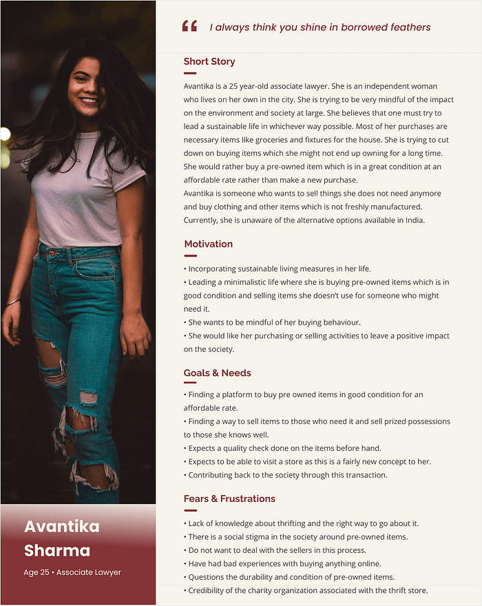
“I don’t see any wrong in exchanging clothes or fixtures or accessories with my friends or colleagues. I always think you shine in borrowed feathers”.
- User quotes
Persona: concerns, expectations and much more unravelled
At this stage, I wanted to pin some of my key quotes and observations, from each of the interviews to a board to help connect the dots (if there were any).
Through these interviews, it became quite evident to me that during the pandemic how the taking-care-of-the- environment and helping-each-other became a much stronger instinct where Empathy became the dominant emotion.
You will find the complete version of the collated notes I made from the individual interview session here.
Here is Avantika, a 25-year-old woman who wants to make conscious buying decisions and want to change them for the better. She doesn’t want to fall prey to fast fashion. Through all of this, she hopes to contribute to society through this simple act of thrifting online.
Affinity Map
Firstly, we need an affinity map to help with our persona creation. I collated all the notes since I find this method to be one of the most effective ones.
To start with, I categorized the notes into 4 broad categories: 1. Online shopping is tough (Frustrations); 2. Comparisons and Expectations; 3. Existing pre-owned buying and selling habits; 4. Desire/s & Non-Desire/s (on thrift stores).

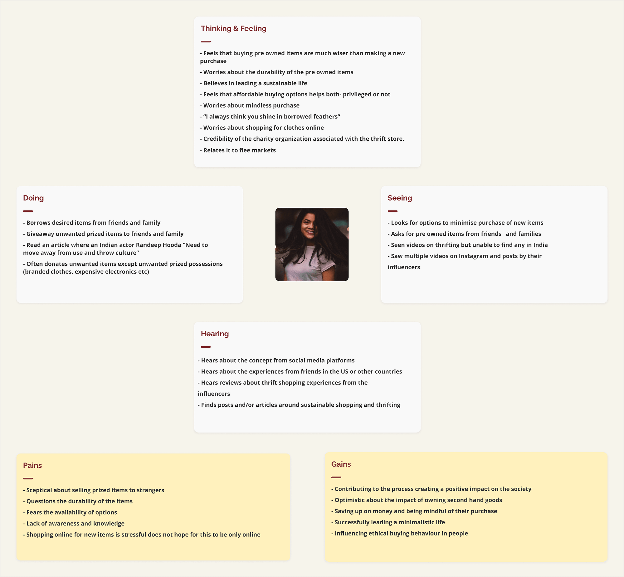
Empathy Map
Then I proceeded with creating an empathy map. I wanted to concentrate on how the user thinks, feels, hears and does when thrifting or on broader terms, buying or selling a pre-owned item.
Here is what I drew out from the Affinity maps:
Problem statement
The problem statement is an understatement. There were many issues that the users discussed and only a few that I have added as a set of problem statement for this project.
I am writing down the main ones which acted as a base for this project:
- How might we create awareness and credibility around thrift shopping
- How might we encourage the selling and buying of pre-owned items on thrift stores?
- How might we create an engaging and conscious community of online shoppers on the thrifting platform?
User Flows
I focused on only two obvious routes here: Buying and Selling flows.
The dilemma here is how to keep the flow as familiar as possible without depending too much on the onboarding screens.
From previous experiences, I found that onboarding screens are one of those flows which are skipped most of the times. Therefore my first draft looked something like this:

The buyer flow was pretty easy to plan as I had studied the flow of certain eCommerce platforms to understand better, the common buying flow of a shopping app. I could have taken a different route, but because the app concept is new to the Indian market that I did not want to disrupt the flow from being a familiar one to one that’s unfamiliar.

Seller’s flow was a bit tricky to plan as the majority who will be using this app, as a seller, would not know how to sell anything.
I wanted to make sure that this is NOT the platform to make profits from the sale but a place where they can sell the items they don’t have any use of, to cut down on waste generation.

Sitemap
Now we are moving towards planning the sitemap for the mobile application. I decided to take this application as an eCommerce platform where most of the actions that the user would take will be one that is familiar to them navigating through an unfamiliar concept.
Buying and selling pre-owned items is not something that the user has done before. Therefore, I decided to break the novelty with familiarity.
Here you can find the user stories created for building a sitemap.
The method I have used to draw out the sitemap is by sketching out a rough user flow which I hoped would give me more clarity. The user flows helped prepare the sitemap that you can see below.

Sketches
I could have proceeded with designing mid-fidelity screens for some of the initial screens but it seemed much easier to sketch them out first because that way you are eliminating the probability of anxiety-driven design thinking.
Testing a paper prototype is cheaper and easier to implement. I wanted to sketch because I wanted to look at the gaps and study deeply from the early stage without spending more time and money on creating wireframes.
Therefore, I decided to validate my sketches first by conducting a Guerilla test with the target audience to identify the possible gaps.

These were some of my initial few sketches of the application. To view all screens, click here.
Key findings from the Guerilla Testing
You might think ‘why conduct a round of testing on sketches when you have user testing as part of the design process.’ The only answer to that is ‘WHY NOT?!’
I would be lying if I said that this round of testing did not save me a lot of hours. I can understand skipping this step if you are redesigning a product or designing a product whose concept is pretty simple and straightforward (I would not recommend this either way but would if you are short on time).
Here are the main findings I focused on before I sat down to work on the mid-fidelity wireframes:
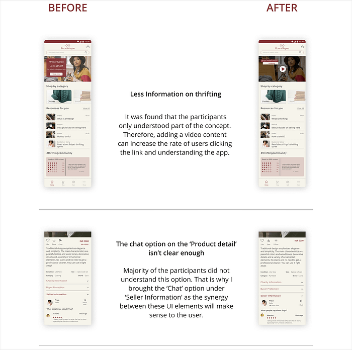
- Firstly, most of the participants did not understand the need to provide a ‘billing address’ in case of selling an item. In addition to this, some preferred to also know a pick-up time or delivery time before making the purchase.
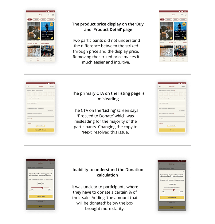
- Secondly, some of the participants enquired if the price set for the item is INR 100 and if the minimum charity amount is also INR 100 then it would be a huge loss for them as well. It did not make sense that the charity amount is higher than the price they are selling a particular item at.
- Thirdly, the sketches made it difficult for the user to understand why contributing to a charity is necessary and what does it mean.
“How come it felt so familiar because I thought I will have to make a lot of pretentious moves but the app takes care of that for me.”
- User Quote
The findings gave a lot of clarity on the improvements that could be made not only in the design and flow but also in the way the concept was presented to the user.
I decided to write down some design recommendations for the same based on the findings:
- Recommendation 1: The screen for billing address to be changed to ‘Pick-up address’ as the former term only creates ambiguity in the user’s mind. An address is necessary for taking the right order and delivering the right order.
- Recommendation 2: While posting an item to sell, instead of asking to choose a charity amount in rupees, a particular user will choose a % of the selling item they would like to donate which will then be deducted after the sale of that item.
- Recommendation 3: Creating a screen explaining the process of donation is necessary to remove the understanding gap. This is after observing that the user did not understand one of the main feature of the app - Donating something while selling or buying anything from the app.
Wireframing
In terms of designing wireframes for the application, there were a couple of applications that I referred to. None of them was Indian (except one which is not a thrifting app but a reselling platform) but at least I got some ideas on how an online thrifting app would perform in the Indian market. The applications that I referred to were: Depop, Meesho and Vestiaire.
These are some really good applications in terms of research, therefore, I did a little heuristic analysis on them based on 3 parameters: Visibility of system status; Help and documentation; Aesthetic and minimalist design.
You can find the whole report on my findings here.
Based on all of the research, testing and analysis did so far, These were some of the key screens which I had designed after many iterations and rounds of changes.
You will find the complete wireframe here.

Moodboard
I always used to collect pictures of things I simply liked visually. Sometimes I make sense of it so that they may be used in a work project or I stick them up on the wall as anyone might.
It was no surprise that I would do the same for this project. Therefore, I created a mood board. This particular concept in itself is so tricky that I had to make sure all the selections inspire some aspect of the design system.
Brand Personality: PooraNayee is a fun, sustainable and conscious Indian brand trying to reduce waste by creating a culture of buying and selling pre-loved items.
Brand Attributes: Conscious, Green, Fun, Intuitive, Desi/Indian

Component Library
I took a lot of image and UI inspirations from here along with colours to be used in the application.
In addition to this, the testing report on the sketches not only helped with creating the screen designs but also helped me with coming up with a brand name- ‘PooraNayee- Old but new for you’.
Through the mood board, I could understand what different UI elements could look like, what colours would suit.
Anyone might expect a green and white tone to the application colour theme and that is a good route but I wanted to create a platform for all, even those who have not yet realized the value of thrifting or sustainable living.
The tricky part was to have a UI that would scream Indianness yet the overall essence of the UI elements being more rugged and minimalistic.
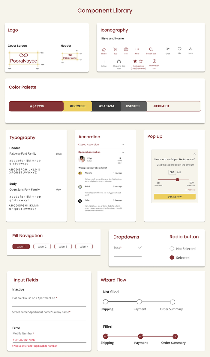
All the elements chosen in this library is based on the research I have been doing on the brand attributes.
Based on these, it was not only convenient and easy to put colours and personality into my Mid-fidelity screens but it also confirms the usage and the mode in which they must be used.
Why have Red? You ask.
You might be thinking “Why Red or that shade of Red? Isn’t it alarming?” Well, if you look at it like that then, yes. But the reason for using Red was because it is a colour well associated with warmth and celebration and trust here in India- Only a particular shade of Red.
There were a few options for the brand colour on which I conducted a small survey. The result being, most were rejected with the majority leaning towards this shade.
High Fidelity Designs
Without further ado, I am showcasing a few designs made for two flow: buyer’s and seller’s flow.
By the way, you can view all the designs of these two flows here.

As I mentioned before the design flow for the buyer was easier. What was challenging here was to set an intention for the buyer that only by looking at the initial few screens, they would trust and proceed with buying a pre-owned, pre-loved item.
That is why the choice of photographs used are such to give a look of a premium platform, showcasing affordable items.

However, there was a different approach chosen while designing for the seller on the platform.
I wanted to create a design that is similar to how someone would post anything on their social media platform.
On this platform what the buyer sees are a couple of pictures of the product, a short description and a few tags on the quality and condition of the product along with the charity that the seller is donating towards amongst other things.
One of the USP of this platform is that in the transaction, there is the element of giving back to society. A buyer has an option but the seller does not where he/she has to donate a certain % of their sale.
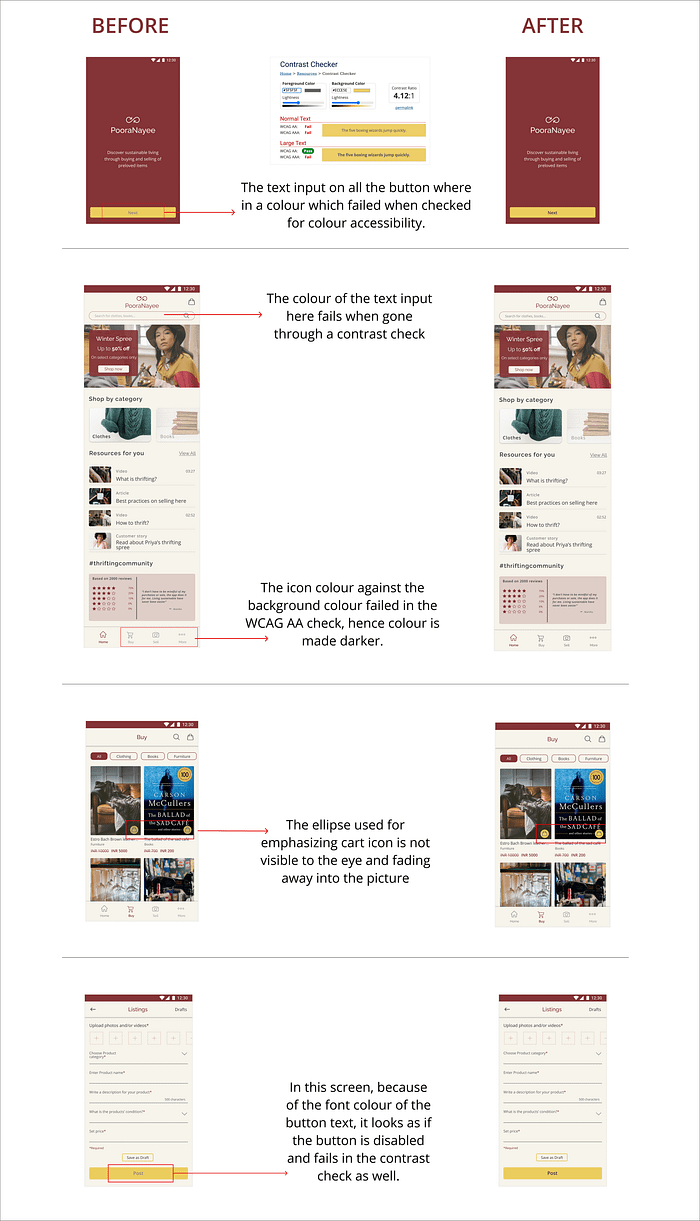
Accessibility Audit
I would always recommend doing an Accessibility Audit on all your designs as some of the colour choice made by you and/or your team might not pass through the WCAG AA ranking. Therefore, I conducted an audit on 3–4 screens to begin with.
Following was the result:
Usability Testing
I would be naive to think that the research and recommendations made on the sketches are enough grounds to deliver the final design of the product. I took it very seriously to have some more time to test out the flows, high fidelity designs and the concept with the user.
I chose the method of remote usability testing given that we have Ms Rona who is here to stay for some time leading to erratic lockdowns. In addition to this, I made sure that I conduct two round of testing in total, just to be sure.
Usability test plan
Before conducting usability testing I prepared a plan which you can read here.
The Goal: The overall user experience in the buying and selling of a particular item in the app.
Here you can read the full report on the Usability test findings.
Final Prototype
Many recommendations were made and based on those, these were the screens I made after incorporating all the changes.
This is the link to the final prototype of the application after incorporating all the changes and feedbacks.
Learnings
What better conclusion to a case study than sharing some of the learnings that I took whilst working on this project. User experience design during the pandemic was very interesting. The different design stages presented their own set of limitations.
I could barely dig out the opportunities underlying those limitations because there were so many. So here I am writing them down:
- Learning 1: Sustainability isn’t as wide a concept here in India as it might be anywhere else in the world. The majority are only now coming to terms with understanding the level of impact they are leaving on the environment and the society at large through their endless consumption. It was very important that on top of designing informative screens that I also create an intuitive flow creating a level of assurance, familiarity and trust amongst the users.
- Learning 2: Had I not conducted those initial set of surveys and interviews, I don’t think the result would have been realistic. It would have been one based on my assumptions.
- Learning 3: Designing an impactful product is only of the whole process of User Experience design. If you don’t have a strong understanding of the product and the business goals, it is quite probable that you would end up designing a strategy far from the expectations of the end-user.
- Learning 4: Lastly, It is very easy to create easy and misleading flows within the app. It is very easy to design deception into your flows. As a UX designer, I have realised it is very important to set some goals, with mutual discussion and agreement with the user, the decision-makers and your team.
Lastly, I want to extend my appreciation for the time and patience of reading up to this part of the case study. It was very important for me to showcase my complete UX journey.
Connect with me on LinkedIn if you would like to discuss or suggest anything on this project or otherwise. I would love a great conversation over a cup of coffee.

